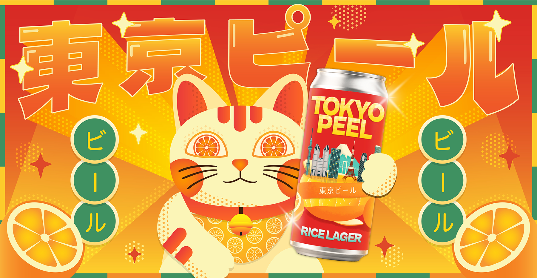
TOKYO PEEL BEER
Role: Brand Identity, Packaging & Motion Design
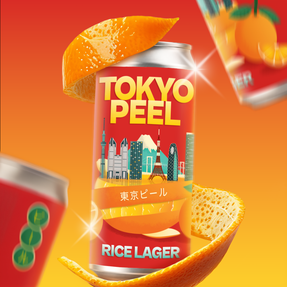
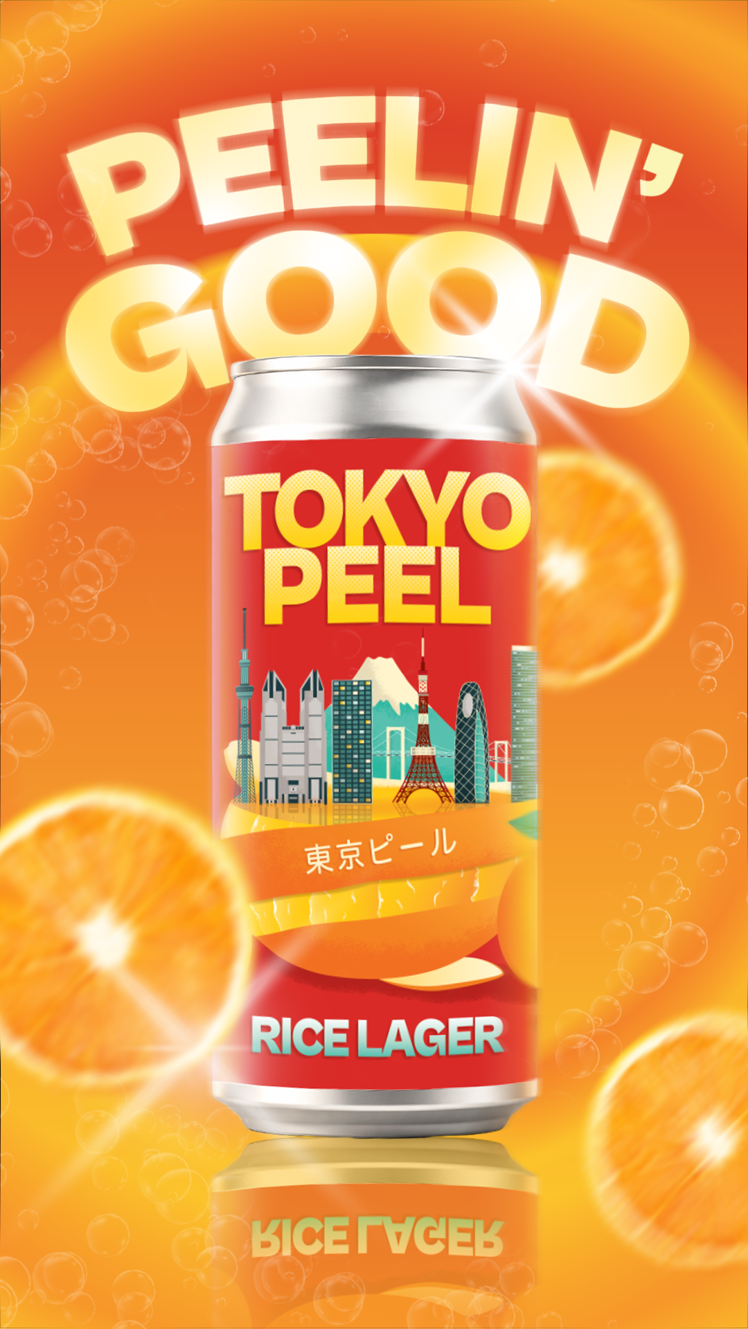
Tokyo Peel is an orange rice lager created for the U.S. market, designed to make an unfamiliar beer feel intriguing before it feels familiar. Rather than resembling a traditional Japanese import, the identity presents Tokyo through a bold, contemporary Brooklyn point of view.The name “Peel” begins as a playful reference to orange, one of the beer’s ingredients, then becomes the central storytelling idea: peel an orange, reveal Tokyo. The key visual brings city and citrus together, while bilingual typography, illustration, copy, and branded touchpoints expand that idea into a larger world.The result is an identity built around discovery, immediate enough to stand out on the shelf, but layered enough to reward a closer look
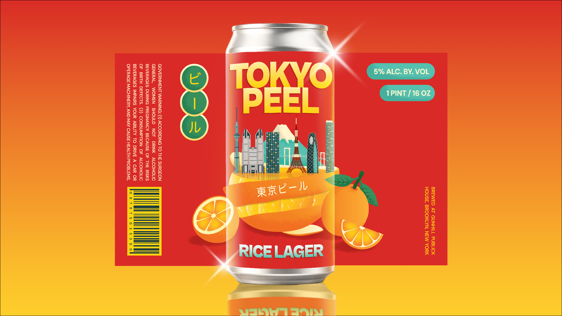
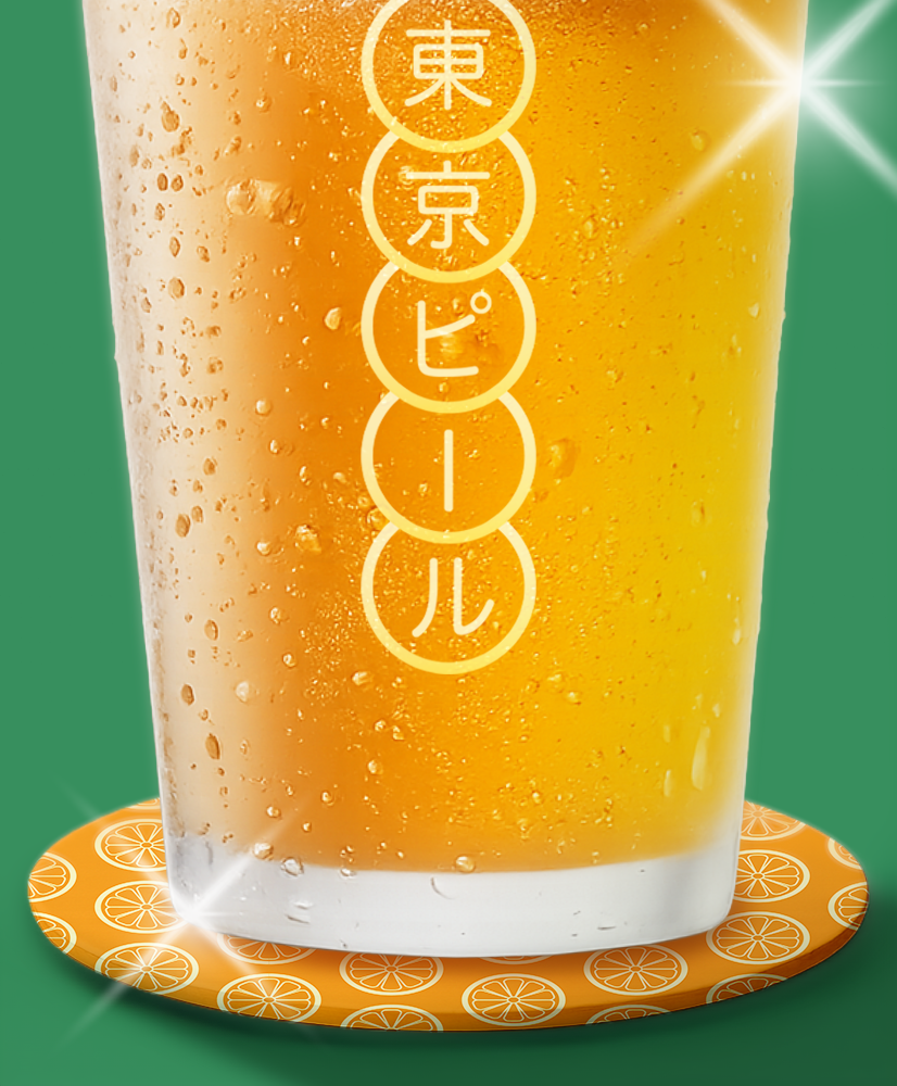
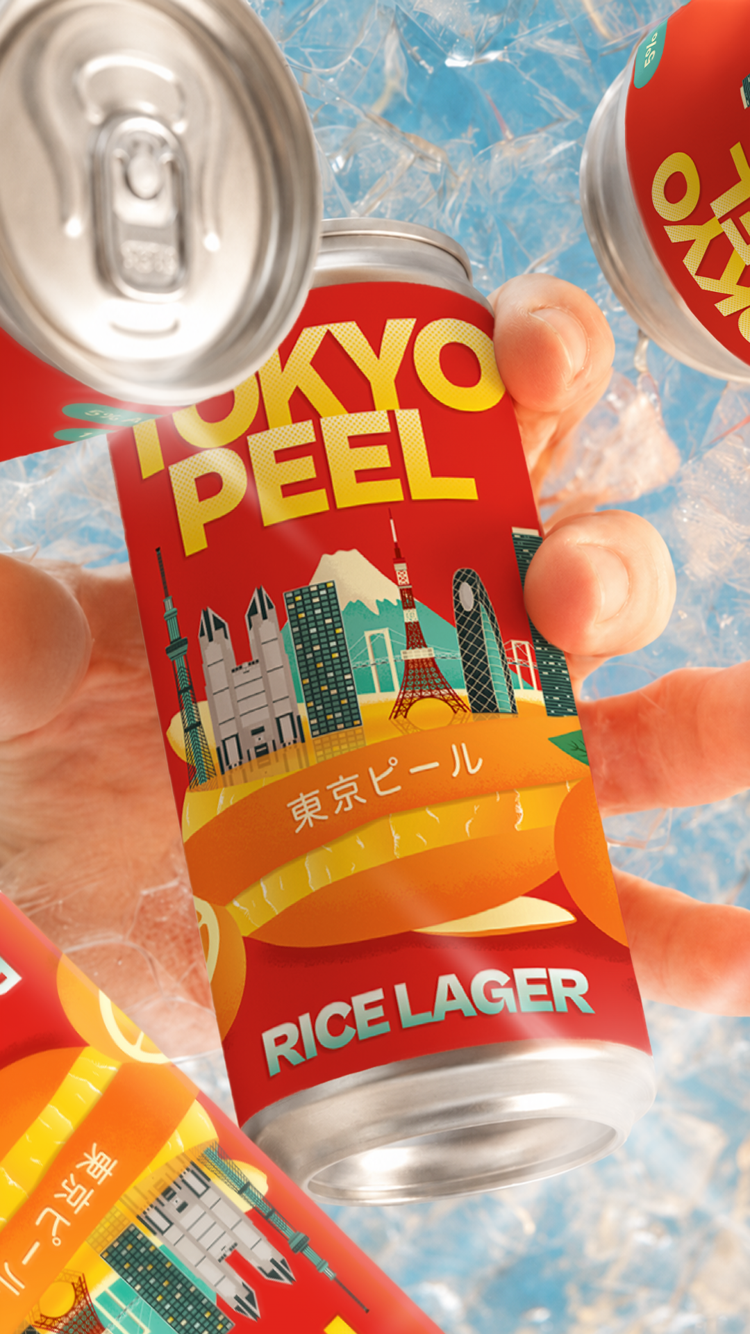
The identity expands beyond the can into glassware, coasters, copywriting, retail objects, and motion, allowing each touchpoint to reveal another part of the Tokyo Peel world.
TOKYO PEEL BEER
Role: Brand Identity, Packaging & Motion Design
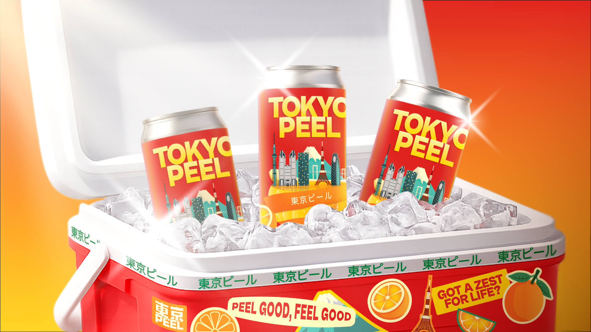
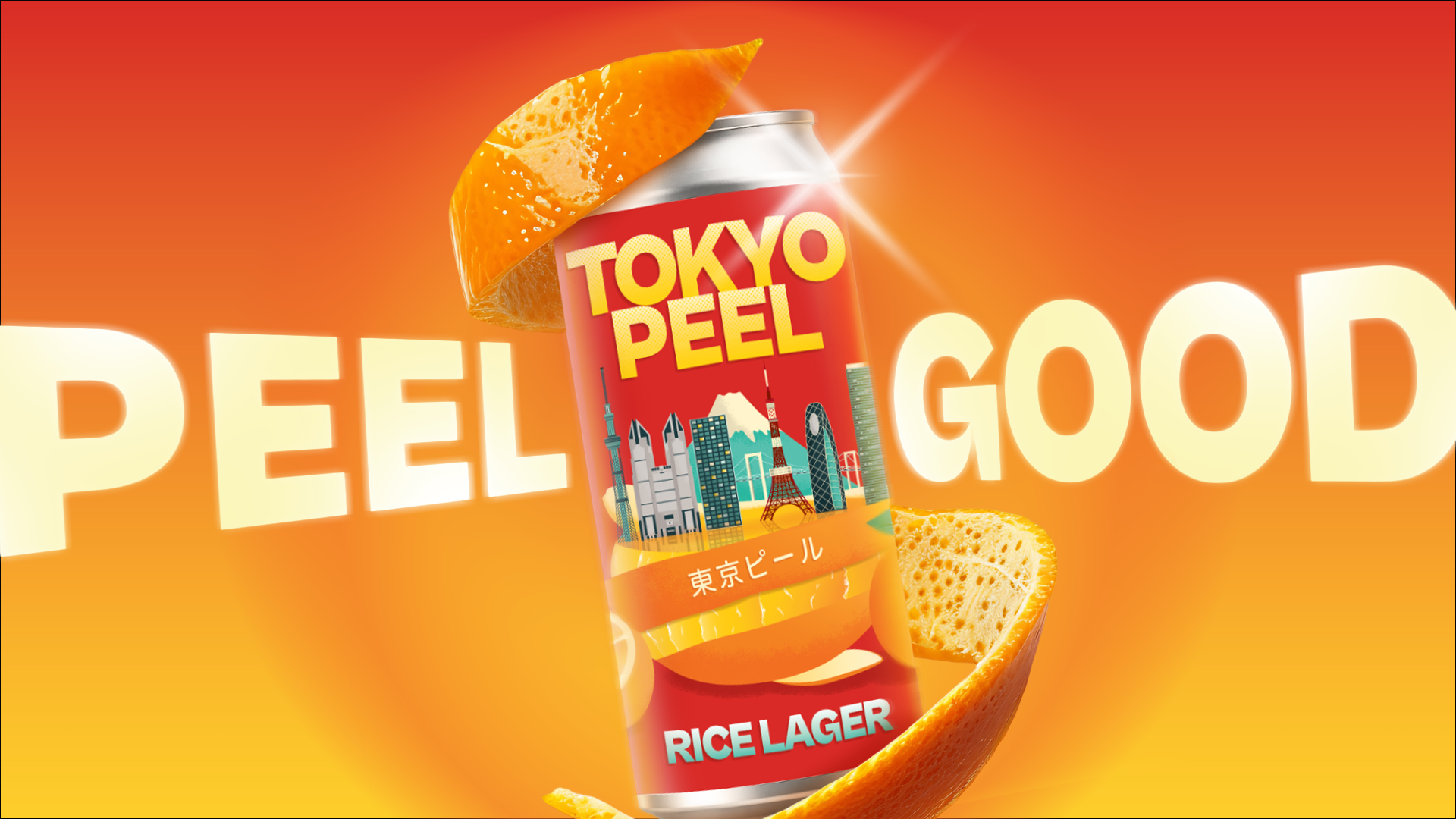
Tokyo Peel is an orange rice lager created for the U.S. market, designed to make an unfamiliar beer feel intriguing before it feels familiar. Rather than resembling a traditional Japanese import, the identity presents Tokyo through a bold, contemporary Brooklyn point of view.The name “Peel” begins as a playful reference to orange, one of the beer’s ingredients, then becomes the central storytelling idea: peel an orange, reveal Tokyo. The key visual brings city and citrus together, while bilingual typography, illustration, copy, and branded touchpoints expand that idea into a larger world.The result is an identity built around discovery, immediate enough to stand out on the shelf, but layered enough to reward a closer look
The identity expands beyond the can into glassware, coasters, copywriting, retail objects, and motion, allowing each touchpoint to reveal another part of the Tokyo Peel world.